B2B2C
Mobile
B2B2C mobile app redesign | Released March 2024

Context
Landing International is a startup launching and scaling beauty brands in US retail, with over 450 success stories to date. I worked on their flagship mobile app, BeautyFluent, that trains beauty sales associates on a catalog of over 50K products.
Challenge
There are a lot of beauty products out there, and it can be hard to know which ones are right for you. BeautyFluent brings key product information to sales associates' fingertips, so they can help customers find the right product faster.
The B2B2C app , launched in 2022, struggled to scale with Landing's growth and engage users. User activity stayed low, even though sales associates claimed to love the app.
This dissonance called for a redesign.
Results
A fully redesigned mobile app for beauty sales associates to learn about over 50K products. Intuitive and familiar UI for quick and easy beauty product search. Modular design made it easy to integrate with science-backed color matching technology to find users the perfect shade, and with a robust ingredient database so users can learn about product ingredients.
5x
User engagement in 1 month
$120K
Revenue increase in Q1
Finding the right product is hard.
Our redesign makes it easy. Our high-level goals were to:
Make it fast and easy to find the products users are looking for
Increase user activity and engagement
Bring in new SaaS revenue based on increased user engagement
Before the redesign, this is what BeautyFluent looked like.
Easy scan and search
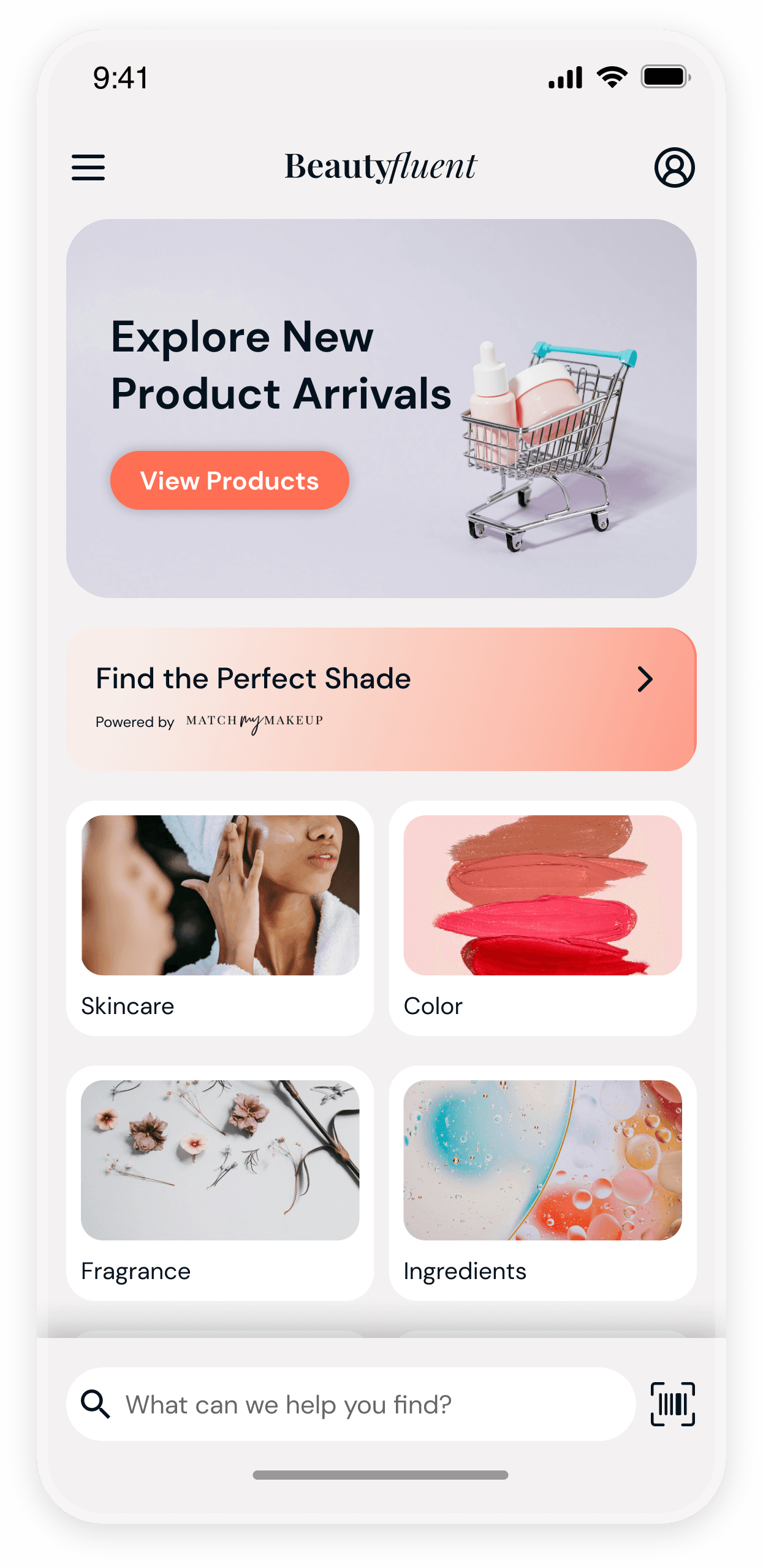
We opted for a more familiar homepage design, so users could now look up brands and products with ease. Users no longer needed to scroll through an infinite grid of products to find the right one.
The bottom placement of the search bar and scan feature further reduces the friction between user and product information. Inspired by Apple's Safari browser setup, I tested the theory that the closer the thumbs were to the search bar, the more people would use it.
Modular product training pages
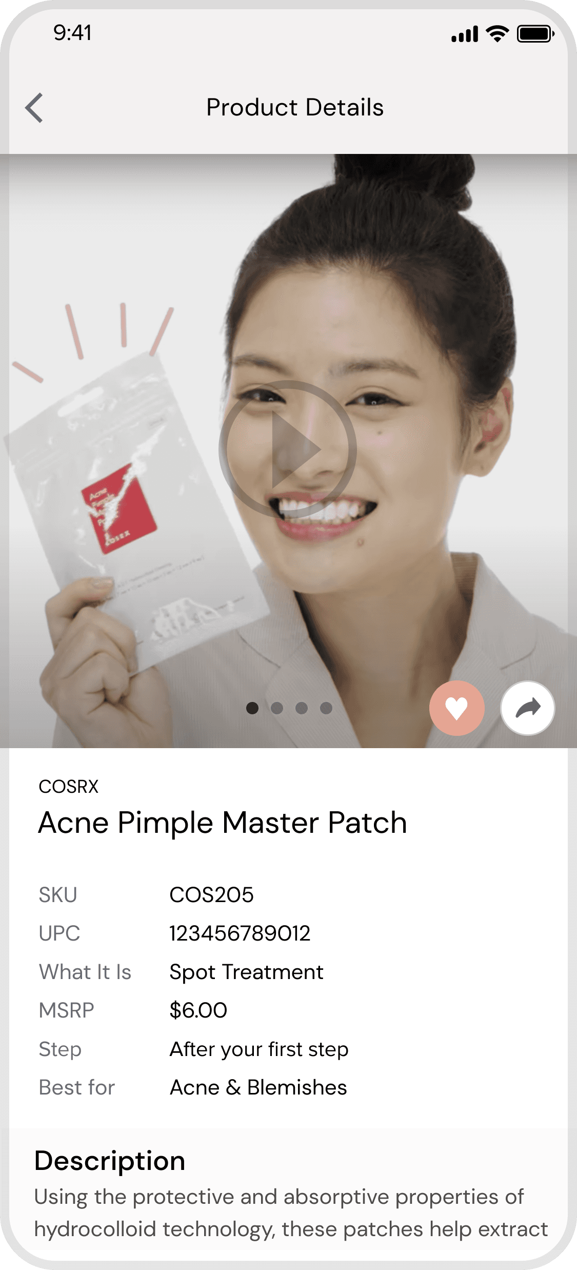
Beauty sales associates need to quickly access product information on the sales floor. Applying the learning design concept of scaffolding, I hid and grouped information behind dropdown blocks to prevent cognitive and visual overload.
Perfect shade matches
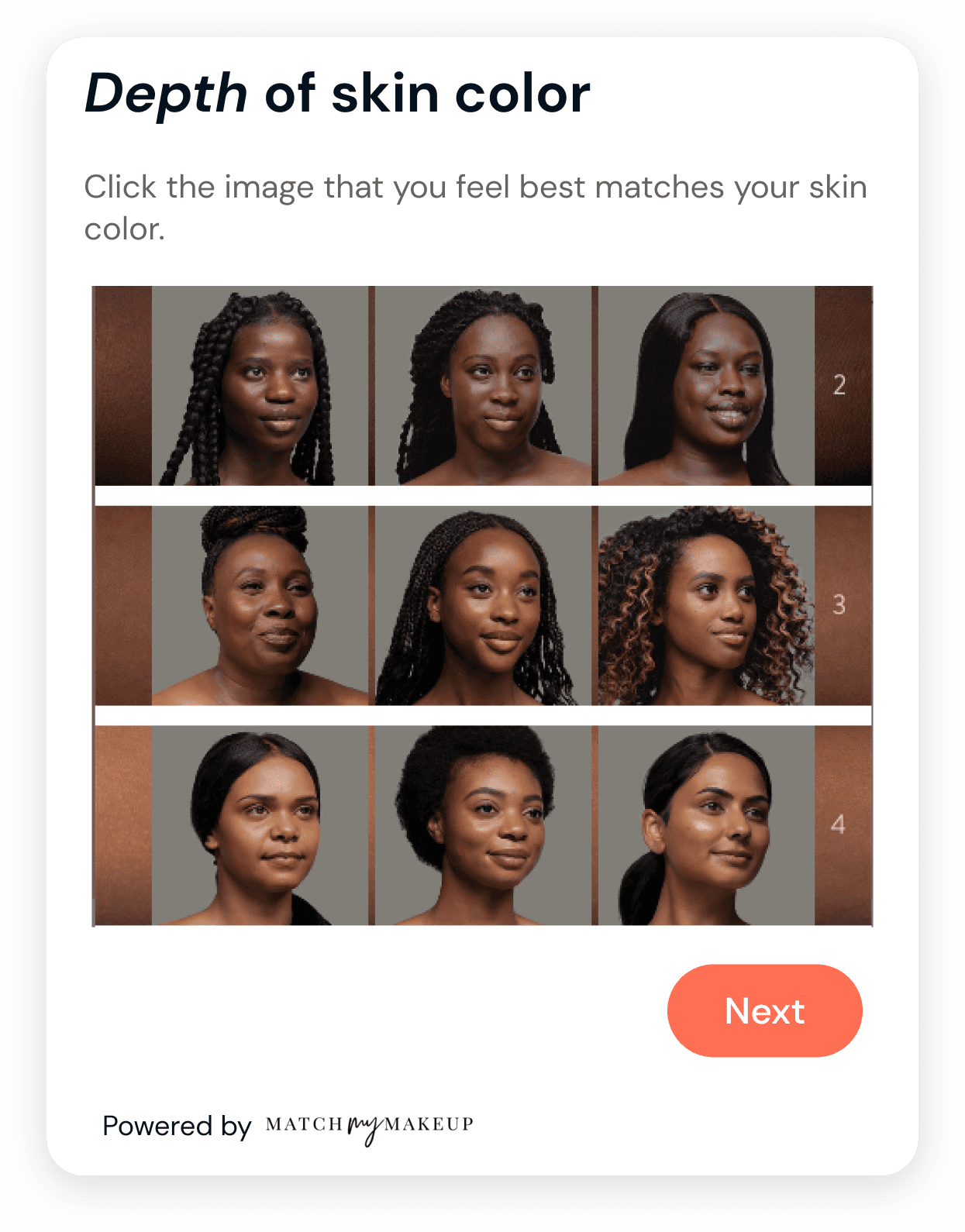
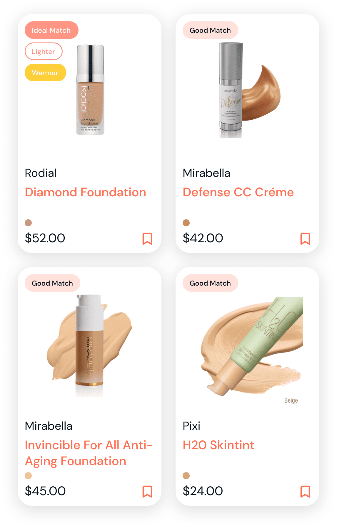
The number one requested feature from sales associates was shade matching. With our new modular tile-based design, it made it easy to integrate MatchMyMakeup's science-based shade matching tool.
Users could now find the perfect product match based on current products or specific undertone.
Advanced filtering
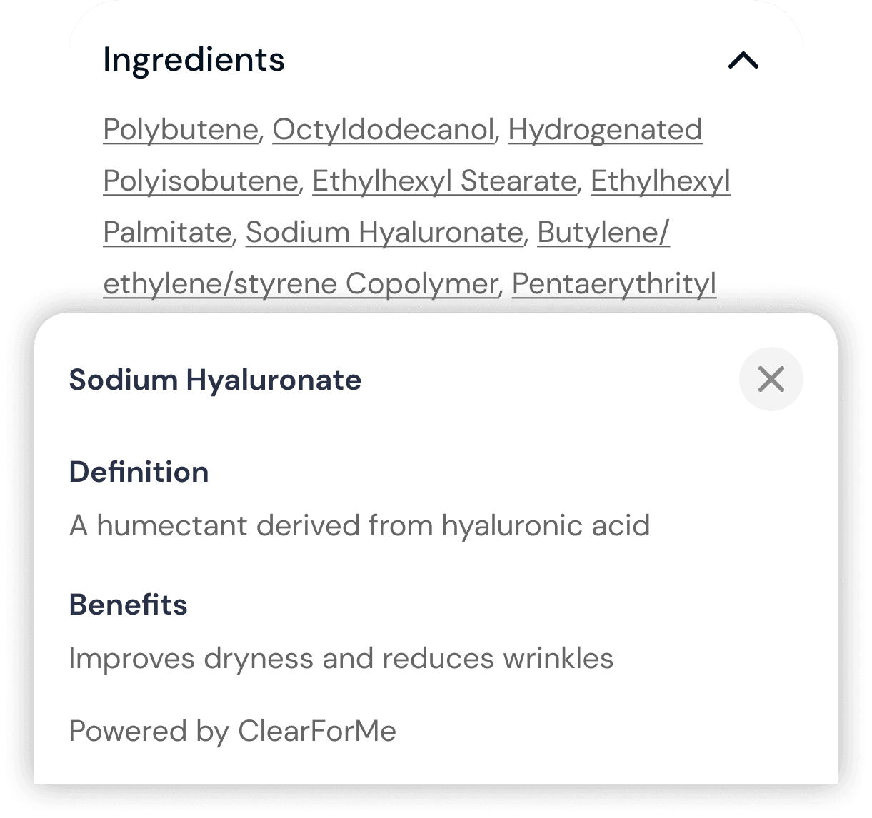
Users could also filter through a catalog of over 50K products by ingredients that work for unique skin types. We also enabled clickable ingredients based on ClearForMe's database, so users could quickly look up definitions of key ingredients that make a product great.
Custom hand-drawn icons
I drew icons for this project so users could identify brands and products based on their business values, whether they cared about fair trade, pregnancy-safe, or vegan guarantees.
Key learnings
🔬 Learn by experiment
Being new to the beauty industry and the only in-house designer, I would have done more user research and testing throughout the process.
🌀 Navigating ambiguity
We worked with vague requirements and shifting deadlines, but establishing a framework for constant testing with real users could have helped us validate assumptions faster and ship a more successful product.
