November 2022
Breaking down Duolingo’s secret sauce
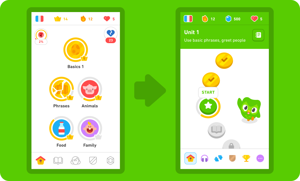
I’ve long been a fan of Duolingo’s simple but intentional design. Learning languages infuses my life with joy and meaning, and having a free app to indulge in as many languages as they’ve yet to support is a dream. With their recent home screen redesign, I finally made a point to break down what I love about the app and what makes for effective, self-paced digital learning.
It’s fun
They’ve done gamification well. All the essentials mirror any popular video or computer game: XP, hearts, trophies, and chests. Their redesign transforms lessons into a game board view, which makes so much sense. I’m a big fan. It simplifies the learning path for the users without sacrificing content.
Duolingo clearly has an excellent design team. Their solid and robust design system makes the user experience visually engaging, consistent, and delightful—grounds for fun and effective learning.
Their cast of quirky characters serve as classmates, friends, and teachers that motivate you and hold you accountable. Cute graphics and animations bring them to life.
Image from Duolingo’s blog.
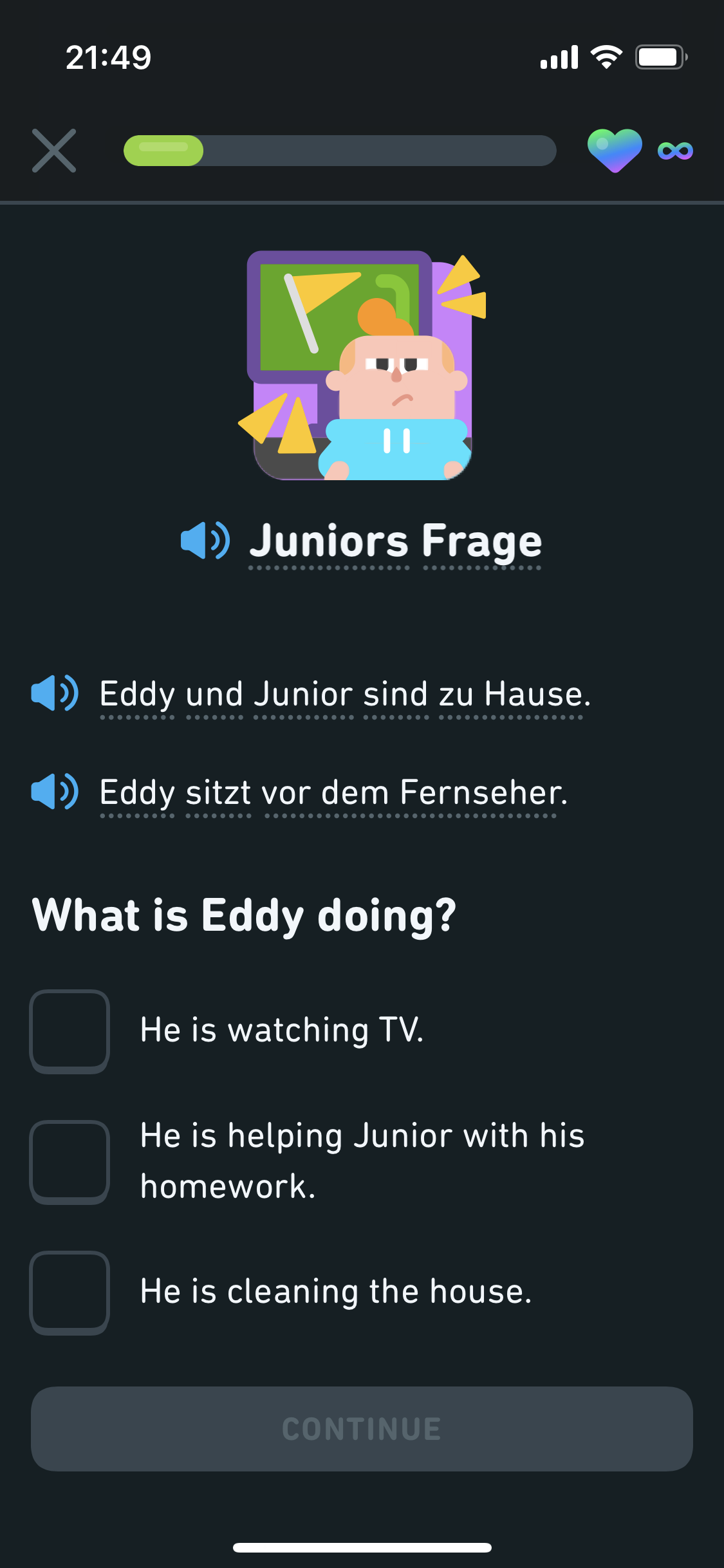
Duolingo is exemplary microlearning: never too much information, grouped and repeated intentionally until you can reliably retain it.
Their Guidebook update is a game changer for providing grammar context to otherwise vocab-focused lessons. I honestly never even realized Tips were a thing in the old design.
It’s simple but intentional
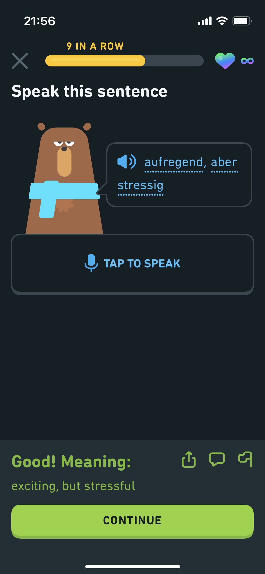
Varied question types and stories are key. STORIES STORIES STORIES. They make the fabric of civilization. Some Duolingo stories also engage you to speak, recreating a low-stakes practice conversation. It was 100% the right move to integrate Stories into the main learning path in this redesign.
Image from Duolingo’s blog.
Sure, they’ve got leaderboards, but it’s hard to get motivated with strangers. Motivation and performance really uptick with friends.
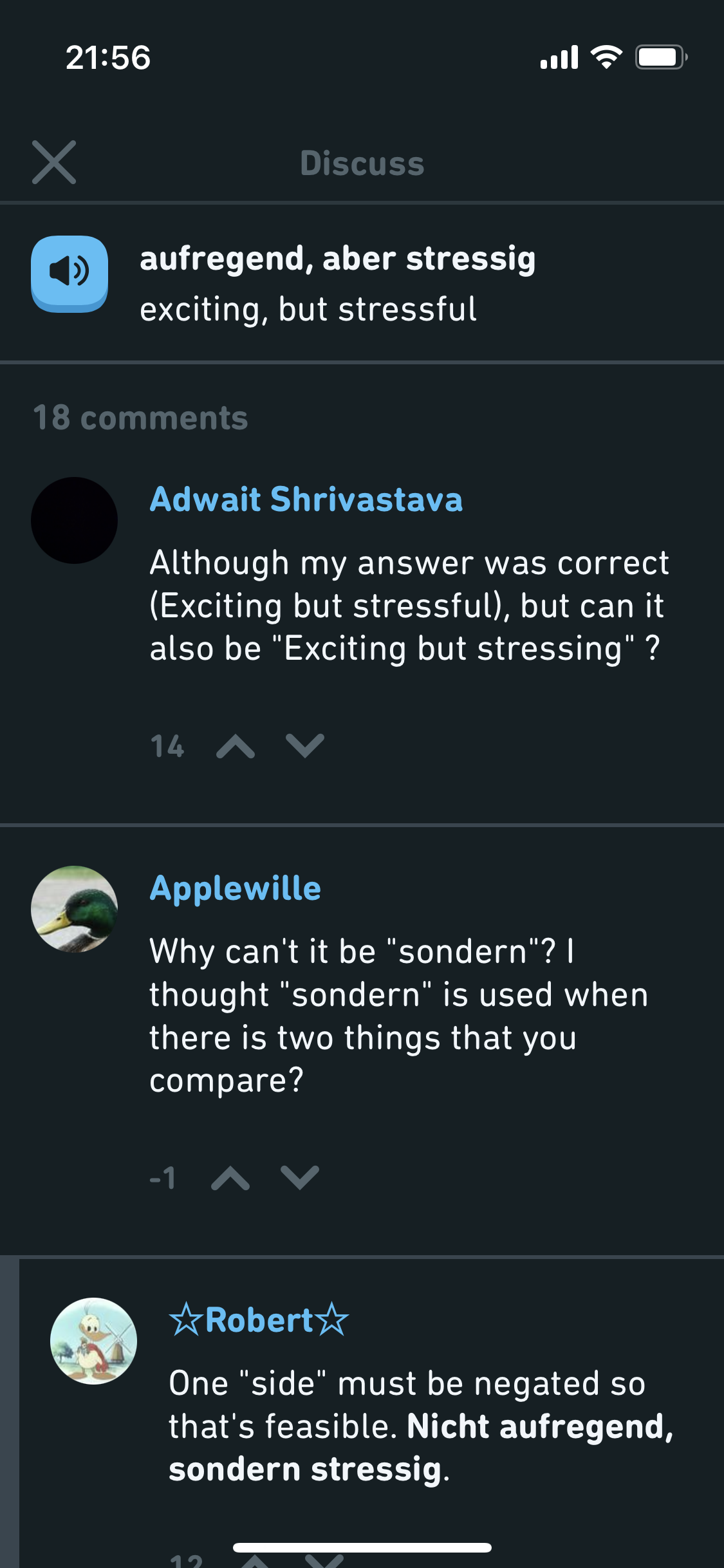
Discussion threads, however, are supremely helpful to see if others are coming across the same issues or questions and find explanations from native speakers.
It’s social
What could be better?
UX/UI
There are too many screens that learners have to click through after completing a lesson. Their Practice Hub feels redundant to the learning path exercises. The “Can’t listen now” option is too close to the “Continue” button. And as an impatient user, I always wish there was a “Previous” option to review past questions. Since language is contextual and fluid, there should also be a more robust mechanism for users to make up-to-date suggestions or corrections to the curriculum and content.
Learning design
I’ve recently been reminded of the powers of a riddle—how they are perhaps the most micro of microlearning with built-in motivation (intrigue) and analytical practice. I think Duolingo could do a lot with integrating riddles into their lessons. Thinking about concepts using unconventional frameworks evolves learning into revelations.
Business model
Since its inception in 2011, Duolingo is still not profitable. Despite a healthy balance sheet and over 500 million registered users, less than three percent of users pay for its premium subscription, Super Duolingo. Its decision to expand product offerings to English proficiency testing, literacy, and math have potential to bridge the profit gap. But the key to sustainability and real impact will be building true partnerships with schools. As a standalone app and tech darling, it can only motivate so many people to get so far in Portuguese or Klingon. Deep and lasting learning cannot be achieved in isolation.


