B2B
Web
B2B analytics dashboard for web | Released March 2024
Context
Landing International is a startup launching and scaling over 450 beauty brands in US retail. I designed a dashboard to support and scale business for many first-time entrepreneurs.
Challenge
How can first-time entrepreneurs scale and sustain their brands? The beauty industry has long been exclusionary, which makes it even harder for underrepresented brand owners to navigate the retail space.
How could we leverage Landing's web platform to bridge the gap between founding a brand and succeeding in retail?
Results
A 0-1 dashboard design highlighting sales metrics and ROI on mobile product training
150+
New brand subscribers
450+
Brands represented
Starting a business is no small feat.
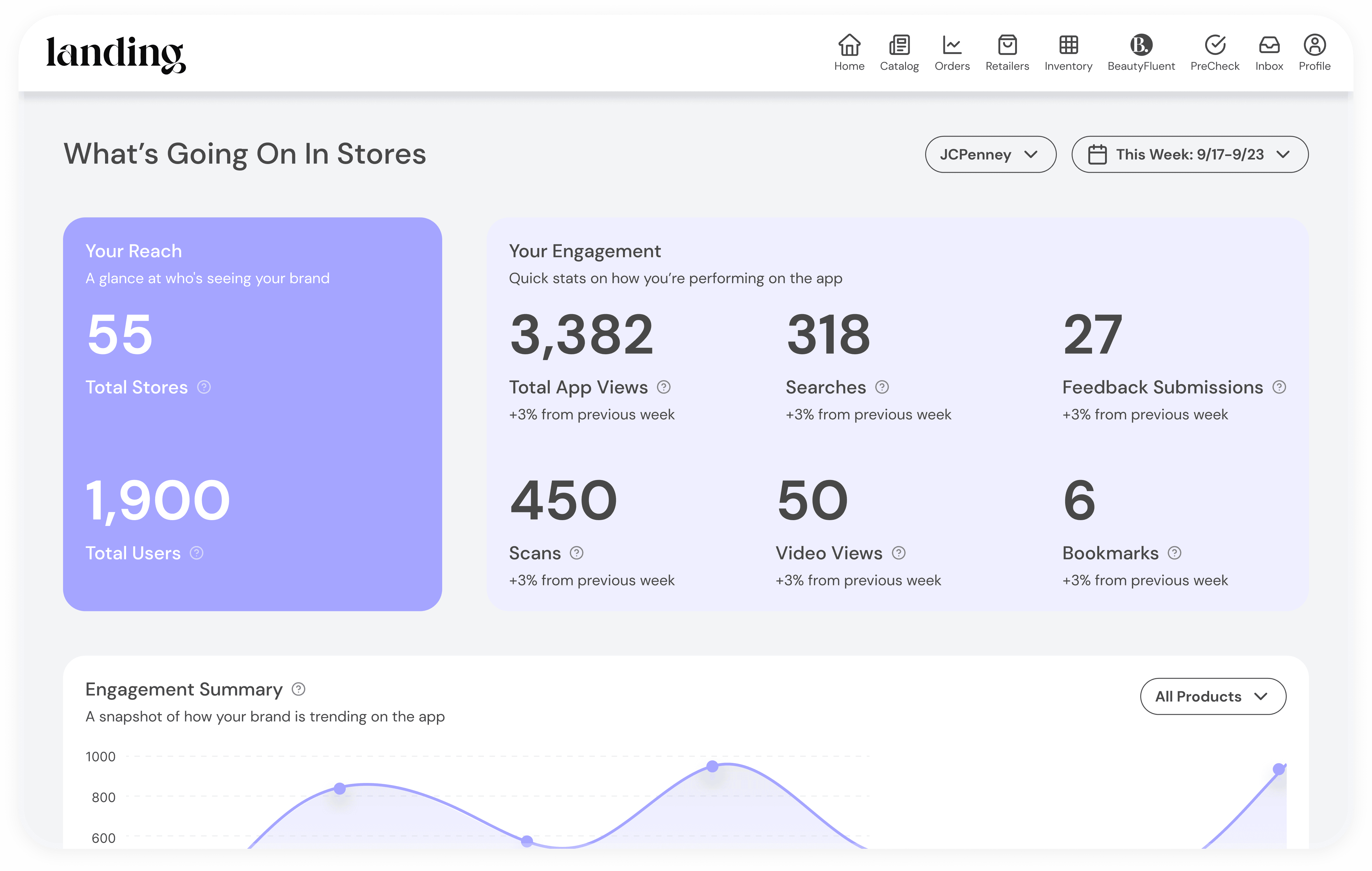
Demonstrate ROI on mobile product training with a custom dashboard
Integrate point of sale data from JCPenney retail distribution partnership
Add new brand subscribers with this new premium feature
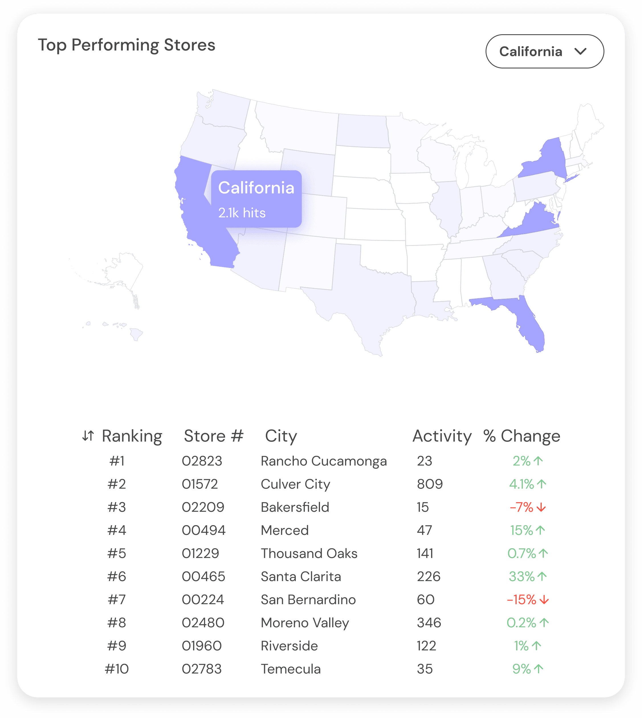
Location-based data
Brands can easily identify which store locations they should focus new marketing efforts on or pull back from to cut losses.
Clear accessible insights
All dashboard data is clearly labeled and intuitively grouped to point brand owners to business success.
Market trends in one place
A built-in word cloud based on BeautyFluent app activity generates market trend insights that help brands optimize their product development cycle.
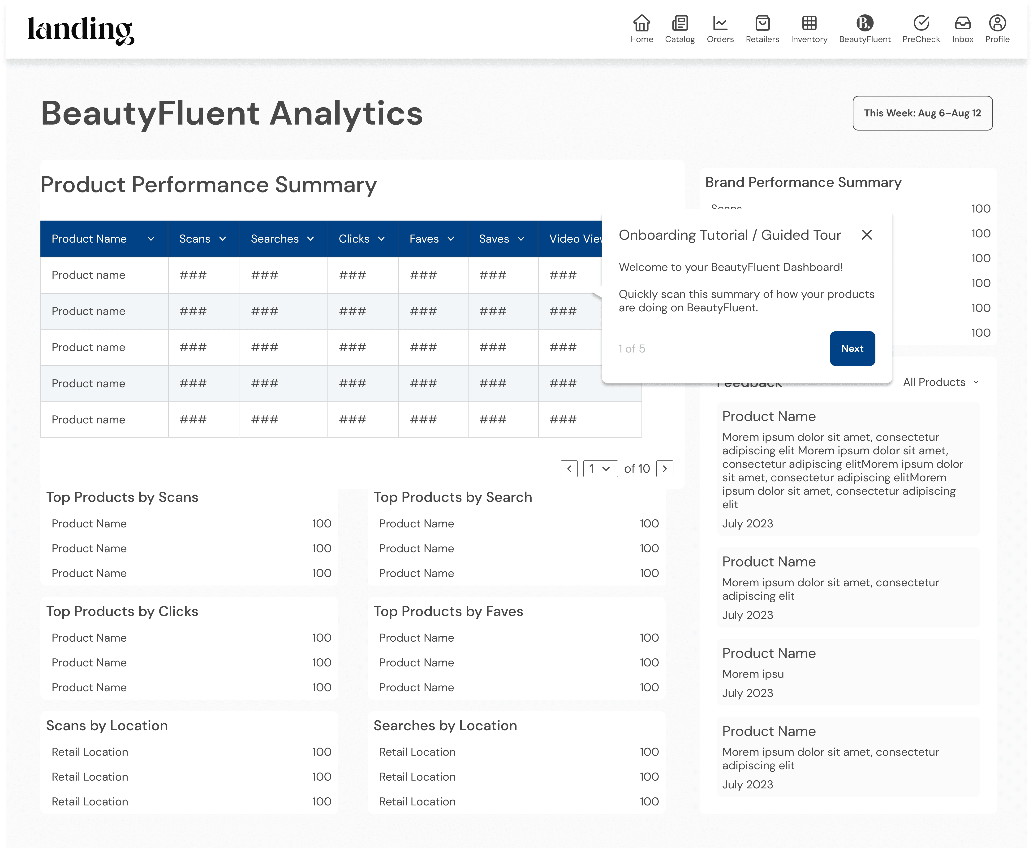
One of my early lo-fi mockups for the dashboard.
Key learnings
⠿ Consistency is key
We faced a lot of limitations and setbacks with this project. We started with complicated legacy designs and code, with no library of files or design system to work with. Through 6 months of incremental updates, I fought for a full redesign for consistency and usability.
🔬 Limited time and budget
Even though our designs reflect the buy-in from C-level executives for a redesign, the MVP we ultimately shipped looked nothing like them due to limited development time and budget. Still, our research and documentation lay the groundwork for more actionable data and standardized reporting.


